Under the Light – Team Fortress 2

TEAM FORTRESS 2

Developed by Valve and released in 2007.

Team Fortress 2 ( Valve , 2007) is a F2P ( Free-to -Play ) multiplayer focused FPS.

The UI in Team Fortress 2 consists mostly of non-diegetic elements meaning that much of the interface is no more than a transparent layer that has been superimposed on top of the game screen and provides information about various different game systems relevant to the player to make decisions throughout a game. The interface relies quite heavily on an array of sounds, such as taking ammunition and health from different places on any given game map. These sounds are non-diegetic, that is , the sounds are neither part of the game world or the narrative being told by the game, they are simple there through the HUD.

Sound is also used as a way to inform the players when the game is about to end through a voice that makes itself audible when, for example, there is a minute left to play in the current game. In addition the voice calls out other different messages that vary depending on the game mode that is being played. The voice is also used when the player needs aid or assistance, one example is that if you are low on health, you can shout, “Medic!”, through a button prompt. This is also shown within the in-game chat to give other players a visual cue as well as an audible cue on the status of their team mates. Both of these sounds are what is referred to as diegetic sound. The difference between the sounds mentioned above to those mentioned earlier are that these sounds are part of the 3D-world as well as fit the game narrative. The sounds of picking up ammunition or health are just that, they have no significance other than to provide a useful sound cue.

To further help in understanding the differences between non-diegetic and diegetic sounds I will include a quote from Mark Grimshaw, from his paper “Sound and Immersion in the First-Person Shooter (n.d)

“Thus, FPS game diegetic sounds extend
the game environment from a flat, 2-dimensional screen to the 3-dimensionality of the external world. The player’s proprioceptive sounds are replaced by the character’s proprioceptive sounds and all other game world sounds envelop the player as part of the game’s real resonating space. These sounds form part of not only the real resonating space but also the virtual resonating space of the game and thus help to immerse the player, both physically and mentally, in the FPS game acoustic ecology.” (Mark Grimshaw, n.d)

Team Fortress 2 relies almost completely on non-diegetic elements. While it may seem overwhelming for people not used to the game the user interface is actually supporting immersion because the game demands a high level information output required for the player to make the right decisions at the right time.

It is also evident that the interface well reflects the somewhat frivolous tone produced by the game, while playing TF2 it is obvious that the game is not a FPS based in reality, like say Metro: Last Light, but is instead a very imaginative FPS not confined by the laws of physics or any of that nonsense that is found in the real world. Because of this the non-diegetic user interface fits with the tone of the game and is the reason for why the UI manages to support immersion. What the interface, however, does particularly well is that it is actively keeping the player up to date on the happenings within a game and supports the game’s high paced and competitive nature, something that Fagerholt and Lorentzon (2009) sees in it’s thesis as a positive factor for immersion :

“When a game focuses on the pleasure of competition, the user interface should support the competitive spirit and make sure that the game rules are clear to the player and that information conveyed to the player is
unambiguous, rather than focusing on a user interface that brings the player as deep as possible into the fictional game world.” (Fagerholt and Lorentzon, 2009).

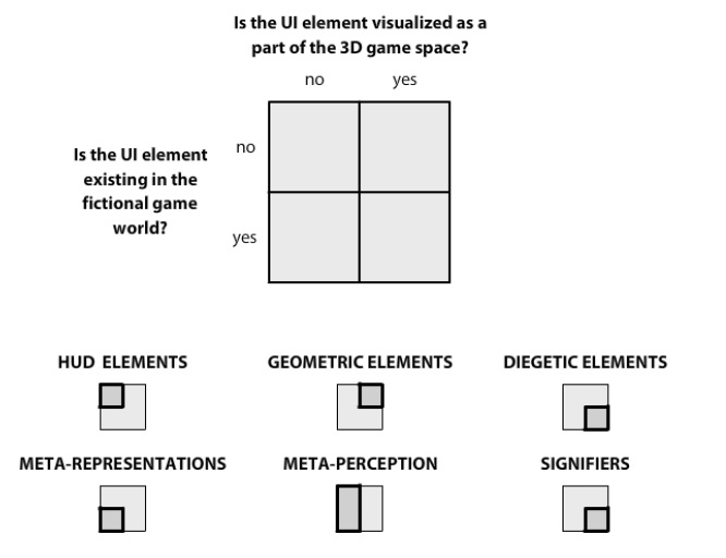
In the image above, we also see some signs of other interface elements within TF2. The blue highlighted object that is visible from a distance is an example of a geometric element while the “exit” sign and the cabinet  just to the right of the rocket launcher are examples of signifiers. These elements, however, should be seen as complementary to the game’s non-diegetic elements that the user interface so heavily relies on in Team Fortress 2.

UI
Fagerholts and Lorentzons map of the user interface elements that can be found in video games. From their thesis “Beyond the HUD” (2009).

As i mentioned in my post of Metro: Last Light the user interface must adapt to the type of game it is being used in. Team Fortress 2 is a highly competitive game and one that absolutely requires players to make on the spot decisions that may lead to the victory or downfall for your team.  Metro, on the other hand, is a slower paced game and one were the player is not required to make super fast decisions, especially so as your playing alone and the consequences of your actions can only benefit or hurt yourself and no one else. So while the use of diegetic elements should be applauded in Metro the same could be said about the use of non-dietetic elements in Team Fortress 2. It may sound contradictory but such is the nature of designing user interfaces for video games and the UI must adapt to the type of game that is being developed. The key part in all this and relevant to whatever user interface elements you may use is that the information being conveyed by the UI must be clear and understandable in any given situation that may arise in a game. There can never, under any circumstance, be any misinterprets made by the UI.

Note: The one image of Team Fortress 2 featured in the post was taken off the PC-version at  2560×1440.  

Sources:

Fagerholt, E., Lorentzon, M. (2009). Beyond the HUD. User Interfaces for Increased Player
Immersion in FPS Games. Available through:                                http://publications.lib.chalmers.se/records/fulltext/111921.pdf

Grimshaw, M. Sound and Immersion in the First-Person Shooter. Available through: http://wlv.openrepository.com/wlv/bitstream/2436/35995/2/Grimshaw_CGAMES07.pdf


Under the Light – Metro: Last Light

Note: Please read the 101 guide to fully understand the terms mentioned in this blog post.

METRO: LAST LIGHT

Developed by 4A Games and released in 2013.

Metro: Last Light is a first-person shooter (FPS) set in the year 2034 in a post-apocalyptic world and is the sequel to Metro 2033.

Metro: Last Light heavily utilities diegetic elements in it’s user interface. Diegetic elements can be seen as the opposite of head-up display (HUD) elements which can also sometimes be referred as non-diegetic elements. Diegetic elements are visualized within the 3D-world of a game and is supported by the game’s narrative.  The most obvious example of presenting the diegetic elements of Metro: Last Light is the clock that rests on the game character’s left wrist. The clock is not just there for the sake of visibility, it fills a very important function, namely that to inform the player of how much air is available in the gas mask one has to traverse in the game’s dangerous outdoor environments which are poison for humans, while also prone to mutated animals that have evolved and adapted to the environment.

UI
The various different user interface elements that can be found within video games. The sketch is from Fagerholts and Lorentzons master thesis, “Beyond the HUD” (2009).

How long you can stay out depends on the amount of air canisters available to you, naturally as this is a video game it can be quite easy to find these scattered around and about while traversing through the eerie, but at times beautiful, environments.  In order for the player to focus on the what is going on in front of him or her and not constantly looking at the watch to see how much further they can go without air, the user interface, rather brilliantly, uses sound as a key factor to make the player aware of what’s happening. The sound, in this case, is an alarm on the clock that goes off when there’s one minute of air left, giving the player a clear indication that they need to replace the air canister as soon as possible without the risk of dying.

As mentioned, when roaming outside in the world of Metro: Last Light the gas mask must be used. The mask itself is also visible in the interface by simulating water droplets, blood and condensation that gradually builds up on the screen as you traverse in the outdoor environments, which is also complemented by heavier and louder breathing from the character that the player is controlling.

OAyBSYA
The outdoor environment as seen in Metro: Last Light. The clock with the amount of air time left can be seen towards the lower right corner. The blue light on the clock means that the player is visible to enemies, the light fades away when the player is sneaking. The gas mask is also visualized on the screen through cracks in the glass.

These elements found on the gas mask are based on what Fagerholt and Lorentzon call meta-perceptual elements in their master thesis: Beyond the HUD (2009). This is important to note because it gives the player a clear symbol when the gas mask is used and when not in use. Meta-perceptual elements is information that can be perceived through a graphical visualization such as blood on the screen as mentioned in the above example. If this information had been conveyed through a HUD it would most likely just have been an icon of how much health the character has at any given moment, displayed somewhere on the screen. By simulating blood on the screen instead the user interface is not as likely to break the immersion. This will however depend on the genre and what type of game it is, as Metro: Last Light is trying to simulate a realistic picture of a post-apocalyptic world having blood on the screen makes more sense, both from the perspective of the game world but also from the perspective of the game narrative, than having a health meter on the screen.

But to understand the positives of diegetic elements used in the user interface of Metro: Last Light I will seek out Fagerholt and Lorentzon (2009) for an appropriate quote:

“The advantage of diegetic UI elements is obvious ; by presenting UI elements not only spatially but as an actual part of the fictional world of the game , there is no risk That the player will be blocked out of the experience due to the non- fictional nature of the informative elements. “

While the example above of the clock and gas mask are clear examples of diegetic elements, it should be noted that these are only two out of many examples that can be found in Metro: Last Light. As such the immersion runs a much lower risk of affecting the player in a negative light, rather the user interface provides many elements that prevent the immersion from breaking.

Obae9ti
In Metro: Last Light you see  your objectives on a note pad which the player character actually has to take up. This is an obvious example of a diegetic element found in the user interface of Metro. By utilizing this type of element the screen is kept clean of HUD elements that would have not been any better in conveying the information the player needs to progress through the game.

This is not to say that the user interface found in Metro consists merely of diegetic elements. Like almost all video games released throughout history, this game too, has implemented a heads-up display as part of it’s user interface. What the developers, 4A Games, have done, however, is to automatically hide the HUD when it is not needed, i.e in non-combat scenarios. By doing this the screen is kept free of any distracting UI-elements and the player can more easily become immersed in the game.

What Metro: Last Light then should be celebrated for is it’s fantastic use of diegetic elements that mask the user interface while at the same time also give it  purpose and meaning to the world and the narrative driven by the game’s remaining components, such as the graphics, art direction, music, level design, gameplay, and story. Through it’s strong use of diegetic elements the user interface found in Metro: Last Light  can be seen not to break the immersion but rather support it by conveying the necessary information through objects that could, realistically, be found in a post-apocalyptic world. Metro should as such be a leading example in how to design and implement a user interface that supports immersion in story rich and relatively slow-paced single player first-person shooters.

To conclude this more in-depth look of Metro: Last Light I want to present a quote from Greg Wilson in his article “Off with their HUD’s!: Rethinking the Heads-Up Display in Console Game Design” that sums up the many issues of only relying on an old fashioned HUD:

However, nothing screams “this is just a game” louder than an old-fashioned HUD. It is not apart of the game world; it is an artificial overlay that is efficient, but often distracts the player from the environment in which he or she is immersed.”(2006).

If you have any comments, questions or just general thoughts on Metro or on the blog itself, then please, but all means, leave it in the field below and I’ll be sure to read them as soon as possible.

Note: The two images of Metro: Last Light featured in the post were taken off the PC-version at  2560×1440.  

Sources:

Fagerholt, E., Lorentzon, M. (2009). Beyond the HUD. User Interfaces for Increased Player
Immersion in FPS Games. Available through:                                http://publications.lib.chalmers.se/records/fulltext/111921.pdf

Wilson, G. (2006). Off With Their HUDs!: Rethinking the Heads-Up
Display in Console Game Design. Available through:
http://www.gamasutra.com/view/feature/2538/off_with_their_huds_rethinking_.php